TGI Fridays: Writing Web Copy for Value-Conscious Diners
Unsolicited redesign of TGI Fridays’ website by Jeff Shibasaki
Part 1: The Challenge
Background
TGI Fridays is a casual dining restaurant that first opened in New York in 1965 and has since expanded nationally and internationally with more than 900 restaurants in 60 countries.
Problem
Value-conscious diners need a way to understand the benefits of TGI Fridays because the restaurant is often indistinguishable from other casual dining chains like Applebee's, Chili's and Ruby Tuesday.
Solution
I believe that building a marketing story around TGI Fridays' slogan (In here, it's always Friday), value-conscious diners will be attracted to the restaurant's benefits.
If this were a real project, I'd know my hypothesis and solution to be true if annual reservations, walk-ins and online orders and app downloads increased by more than 7%.
Scope
While I did the entire redesign myself, I've only detailed my process for writing the copy.
Roles
Wrote the web copy
Created the visual design
Tools
Dropbox Paper
Sketch
Copyright
The App Store badge is a copyright of Apple and the Google Play badge is a copyright of Google. Photos in my design are copyrights of TGI Fridays.
Part 2: The Process
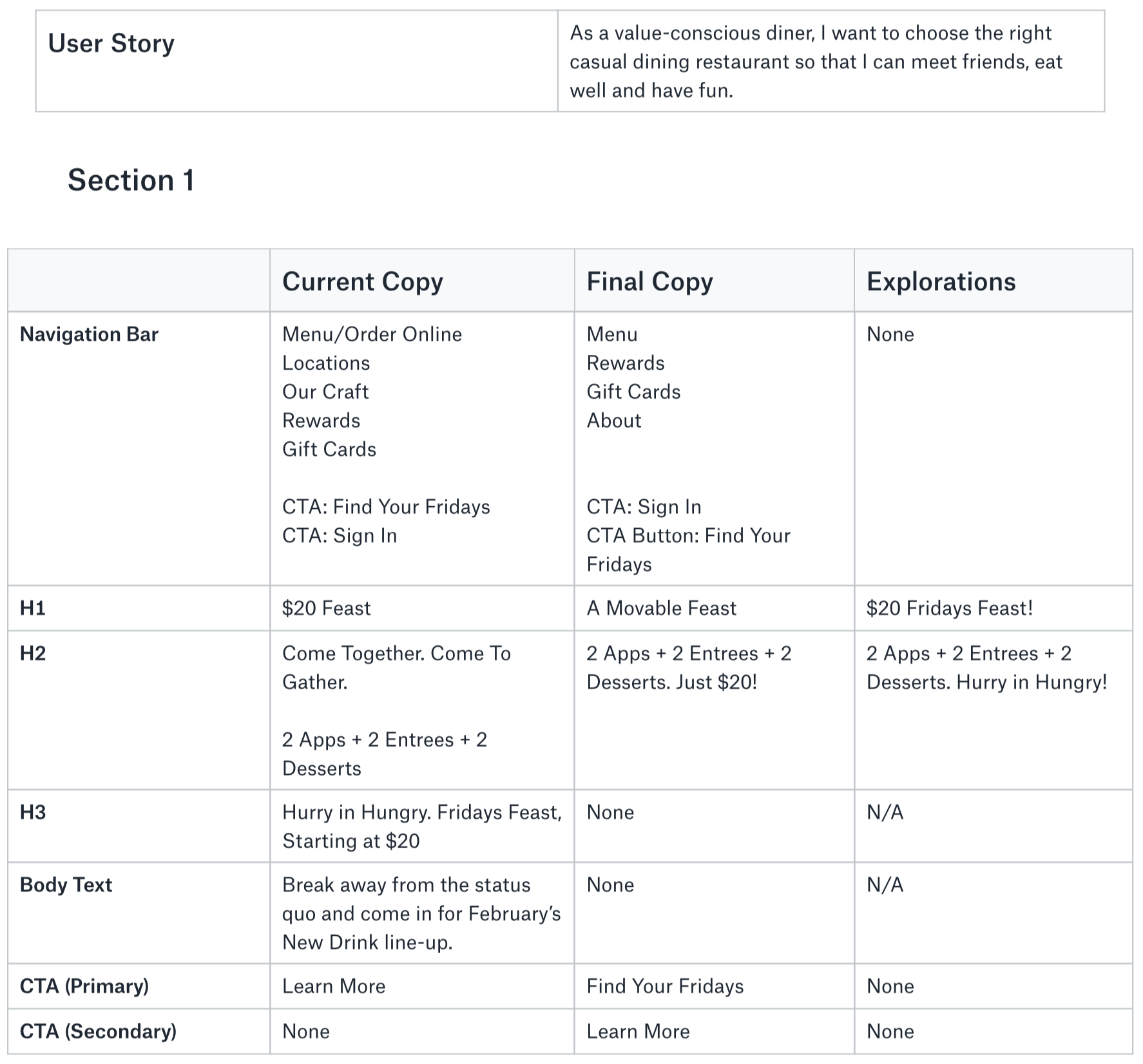
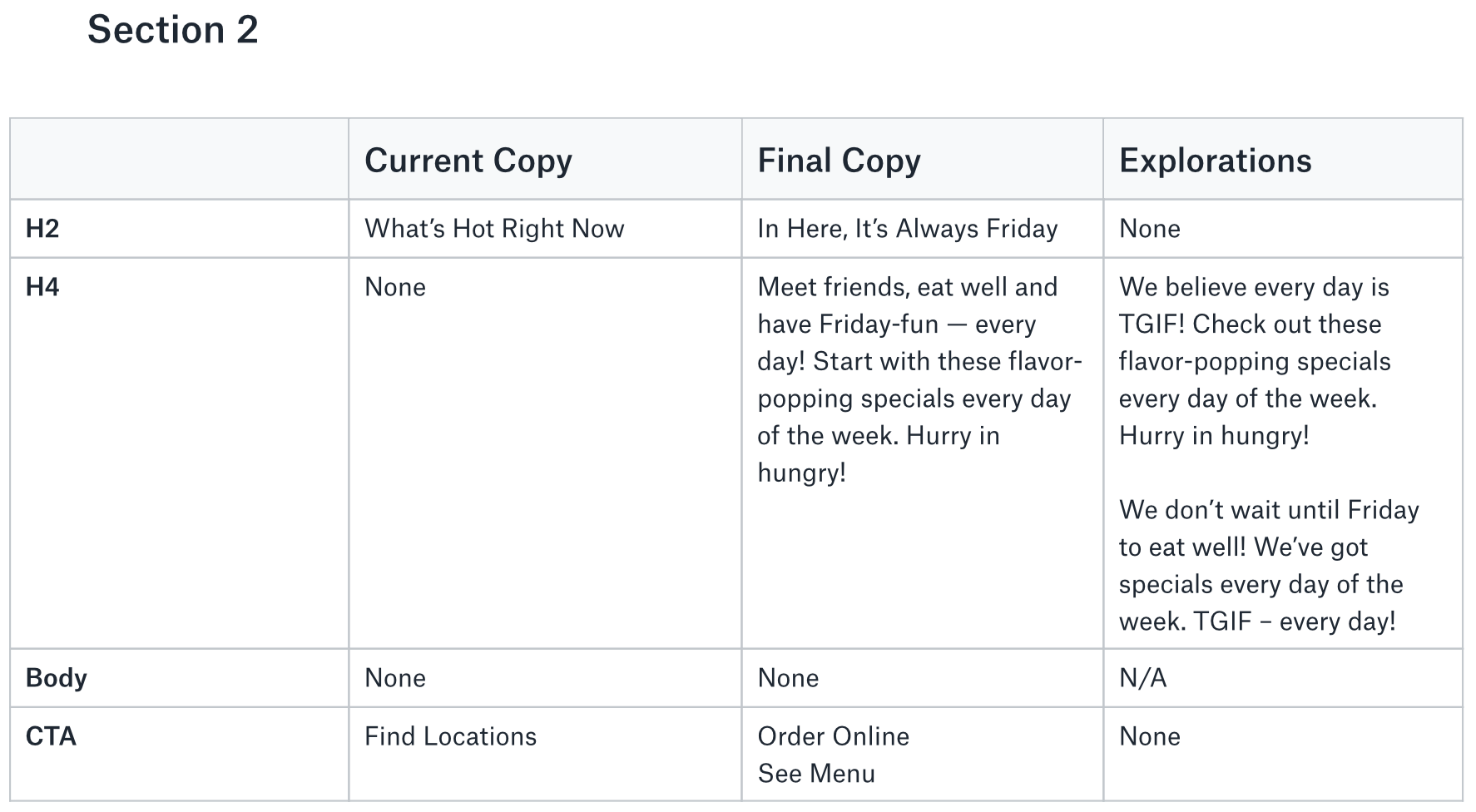
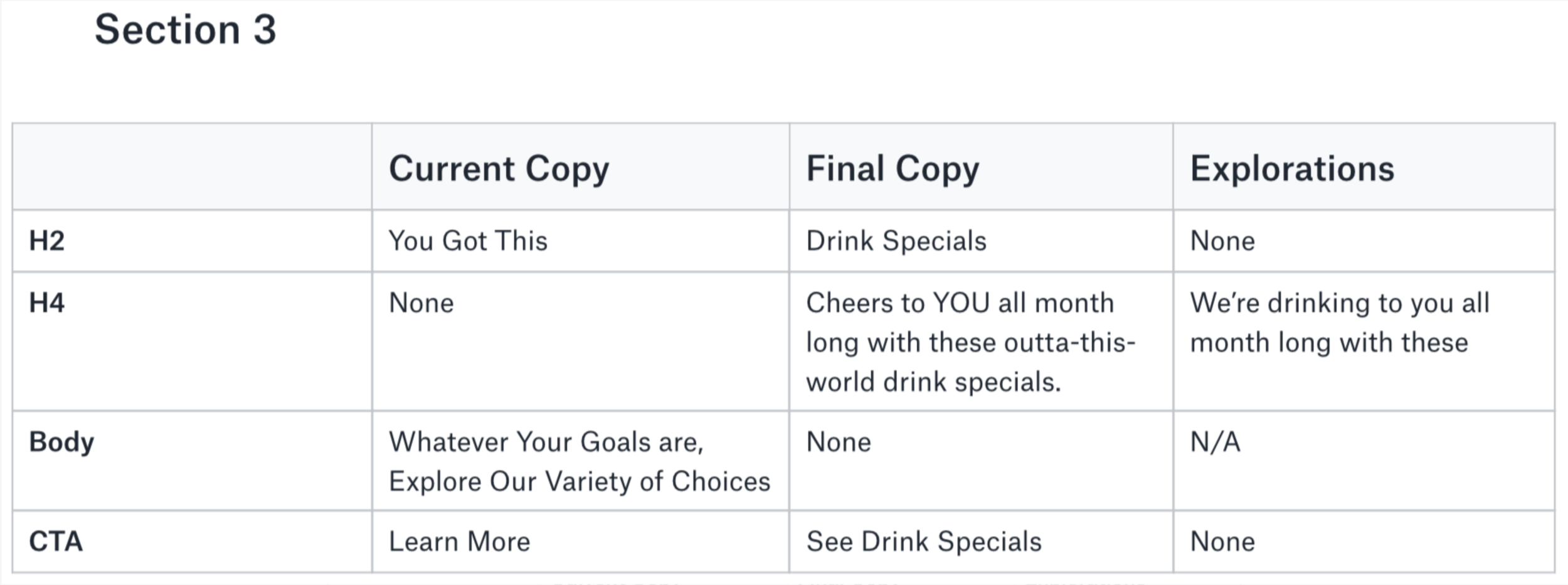
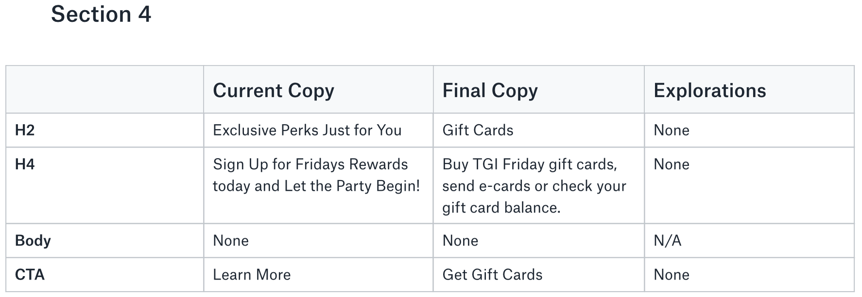
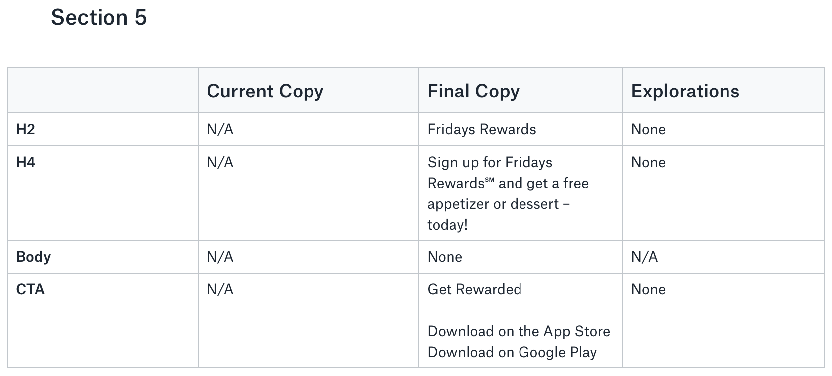
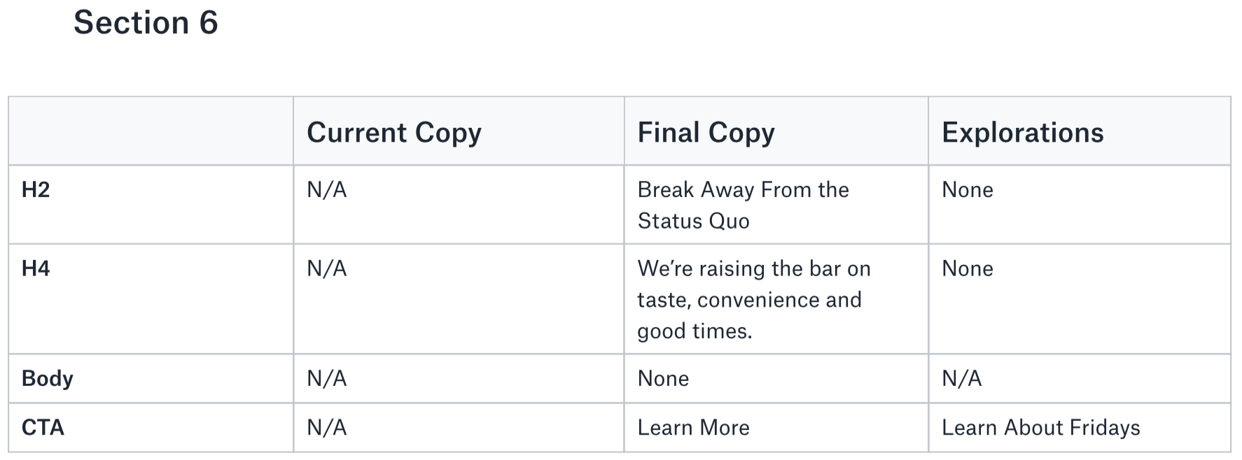
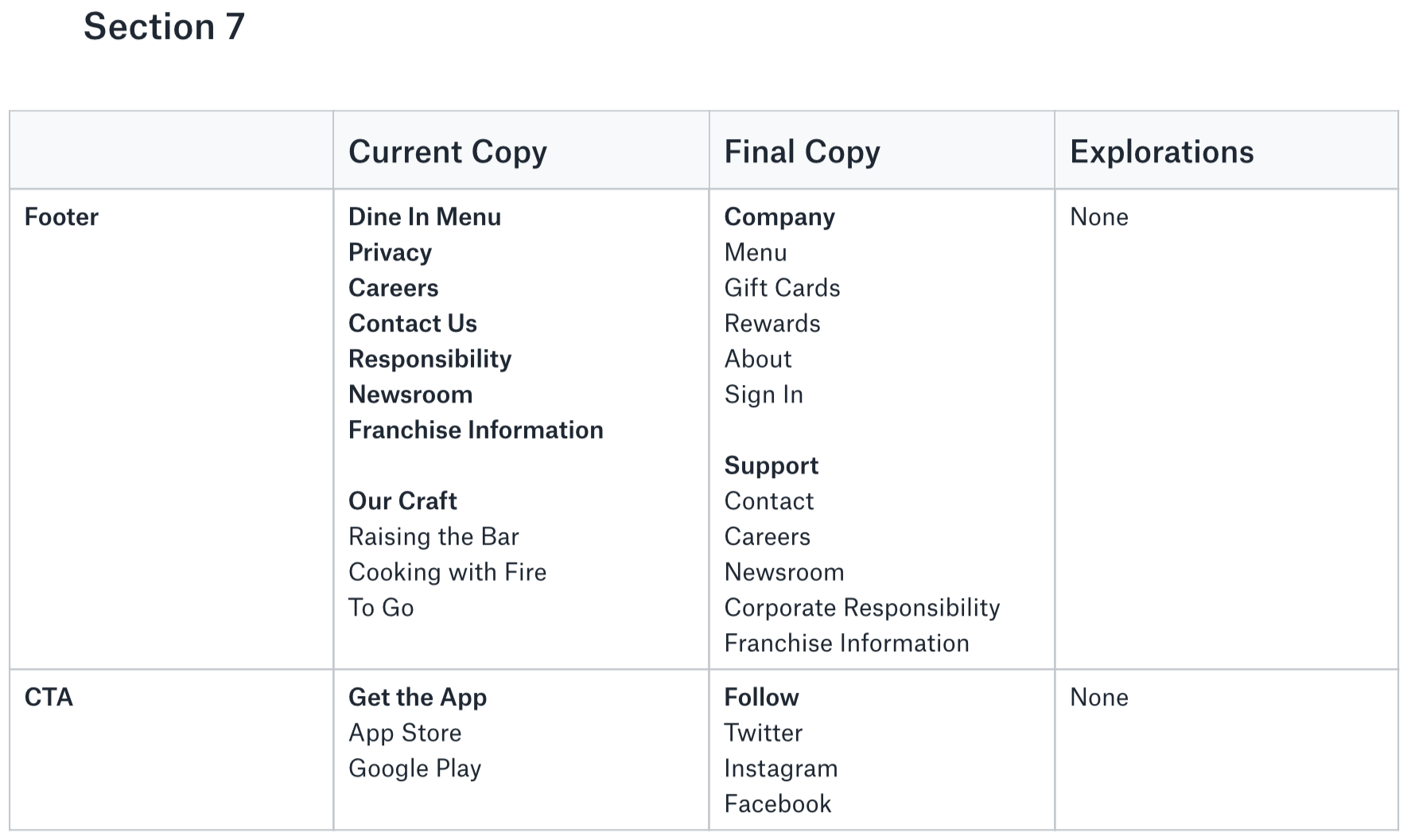
I started writing the web copy by creating a user story that clarified who I was writing for and what they wanted to accomplish:
“As a value-conscious diner, I want to choose the right casual dining restaurant so that I can meet friends, eat well and have fun.”
Then, I created a copy doc to house all of the project's copy. By focusing on the user goal, I added several sections that communicate TGI Fridays' value, specials, gift cards and rewards. I also added a section to differentiate TGI Fridays from the competition.
Once I completed the web copy, I realized that I could combine the email sign-up form with downloading the mobile app to illustrate the benefits of Fridays Rewards. As a result, customers would get a free appetizer or dessert and earn points and TGI Fridays would grow their email list to market directly to customers –– a win-win for everyone!
Though not detailed herein, the user story also provided direction for completing the visual design.
Part 3: The Solution
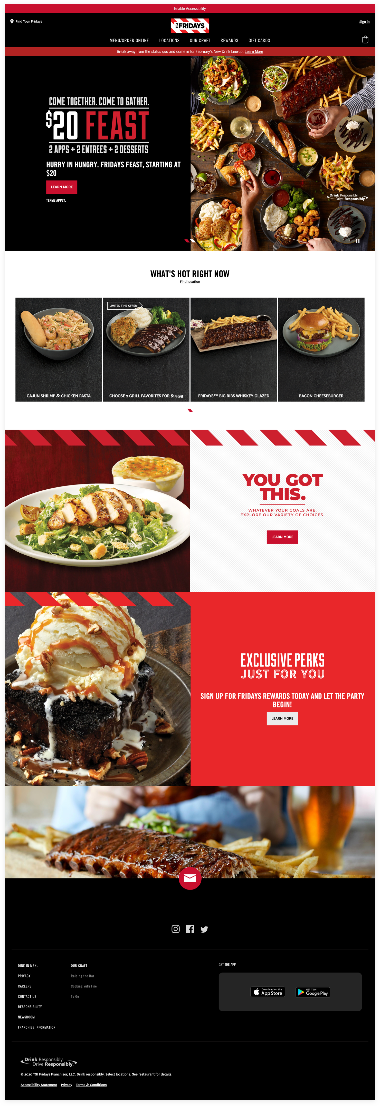
The web copy, combined with the high-fidelity mockup, fulfills the user goal for choosing the right casual dining restaurant to meet friends, eat well and have fun. The CTAs also help value-conscious diners find a TGI Fridays near them, order online, buy gift cards, sign up for freebies, download the mobile app and learn more.
Final Thoughts
Web copy is most effective when it's written for a specific user-type and outlines the benefits clearly, concisely and repeatedly. I attempted to do this throughout this project to tell a more compelling marketing story for value-conscious diners.


